Current page
The renewed ZAIKO logo is filled with a lot of thoughts!
Product updates

Everyone, have you noticed that the ZAIKO logo has been updated?
To mark one year since ZAIKO started live-streaming with electronic tickets, we underwent a renewal on April 26, 2021, to move towards the next step.
And this time, we wanted to share the behind-the-scenes of that renewal, so we organized a roundtable discussion!
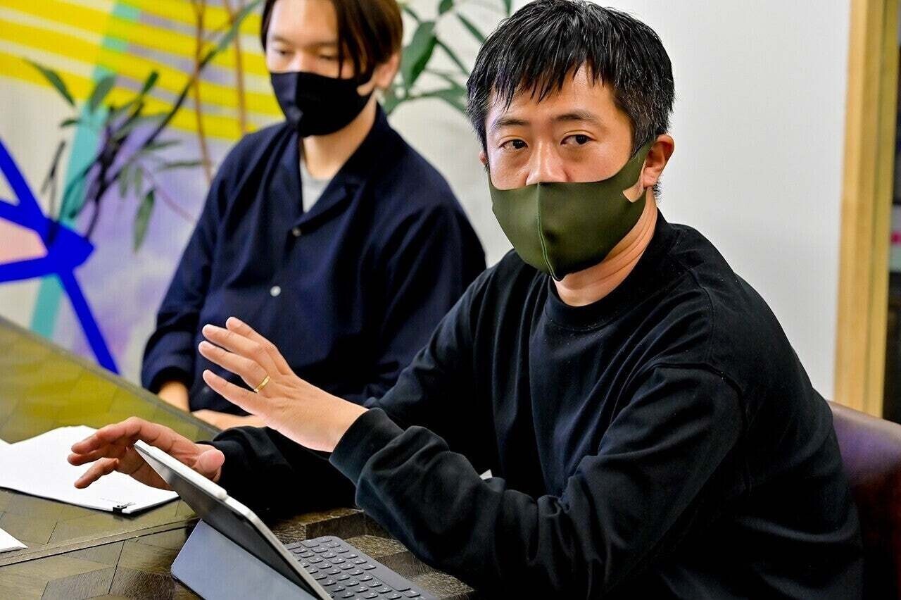
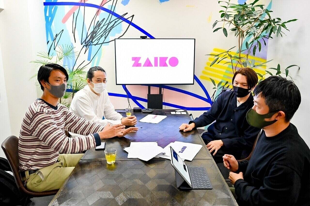
Joining us were four participants: Tadayoshi Iguchi, CEO of IN FOCUS who designed the logo, art director Shinya Nakayama, and Akihiro Ohno, marketing group manager from the ZAIKO team, and Ryuta Tate, brand strategy manager.
We heard some really interesting insights!
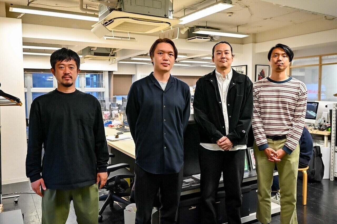
▲ From left: Nakayama from IN FOCUS, Iguchi, Tate from ZAIKO, Ohno
What Is the Vision Behind the Logo?
ZAIKO Editorial Team:
First, could you tell us how the decision to renew the logo came about?
Ohno:
Originally, ZAIKO started as an electronic ticket platform in 2019, but as we entered 2020, the impacts of the COVID-19 virus reduced real events and increased streaming live performances, changing the landscape of live events dramatically.
We have been developing various products to address the industry's challenges in today's world, aiming to build an ecosystem around live events and reaching beyond just being "a ticket company". Therefore, as part of our rebranding efforts, we decided to redesign our logo.
ZAIKO Editorial Team:
Why did you choose IN FOCUS as a partner?

Tate:
After starting production with our internal design team for a while, we began to think, "Wouldn't it be better to bring in external ideas to drastically change our image?"
When searching for external partners, we needed someone who understood web services since ZAIKO is a web service, and someone who also understands content well, such as video.
From my experience working at a web production company, I often found a gap where dedicated web professionals did not understand content well, and those strong in content were often weak in web. So, we researched companies that strike a balance in that area and chose IN FOCUS.
Iguchi:
I'm glad to hear you say that. I started with graphic design, began self-learning photography, worked at a web company in the USA, and after returning to Japan, I was involved in producing a web magazine. I wanted to create a company that could integrate those elements, which is why I started IN FOCUS. I wanted to work with people like this.
ZAIKO Editorial Team:
Oh... mutual love.
Iguchi:
During the transition to the next phase in the live sector due to COVID, ZAIKO's name frequently came up, and I thought they would expand on their current trajectory. However, upon meeting and hearing their thoughts, they seemed focused on multi-faceted expansion. I was very attracted by that.
Additionally, I was actually already acquainted with Ohno. When he was at the media "VICE", I had received requests for creative production from "VICE" and worked with him. So, I thought that might be why I was contacted, but it turns out Tate was completely unaware of that, which surprised me (laughs).
Nakayama:
Earlier, Ohno mentioned ZAIKO's future vision, and we received a well-organized document from Tate, which made it much easier for us to start.
Tate:
In addition to the diversification of supporting creators that Ohno mentioned earlier, optimizing for the Japanese market was also one of our visions. Since about half of ZAIKO's employees are foreign nationals, the design tends to be more internationally friendly, leading us to consider how to communicate as a brand within the Japanese market. Those are the two axes.
A Design Loaded with Meaning
ZAIKO Editorial Team:
Please tell us how you translated the vision into design.
Ohno:
Among the proposals from IN FOCUS was the concept of "a collection of diverse lines and shapes," which matched perfectly with the presence of ZAIKO. As Tate mentioned earlier, our internal team is diverse, and the event organizers and artists using ZAIKO showcase a variety that goes beyond just entertainment like music, theater, and art, involving users from all around the world with various nationalities and preferences.
ZAIKO Editorial Team:
The three-dimensional design is also impressive.
Iguchi:
When I first heard from Tate, I felt the "depth". In my image, ZAIKO, which became widely known around last year, would expand its business straightforwardly, but now it wants to start various services and become a presence that feels closer to the fans. I sensed "depth" in that value and wanted to express it.
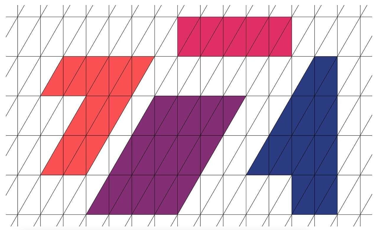
Two-dimensional structures consist of the X and Y axes, but adding the Z axis makes it three-dimensional. Z is for ZAIKO’s Z... When creating the logo, it is crucial to cherish wordplay and coincidences. Those lead to unshakeable value. By layering multiple concepts, it provides reasons that make people think, "This is the only one."
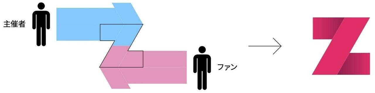
ZAIKO Editorial Team:
There was also an illustration in the materials explaining the design concept, where the arrows connecting the organizers and fans formed a Z.
Nakayama:
While creating a design consisting of various shapes is not a rare technique, I think it is the incorporation of ZAIKO’s unique elements that gives rise to identity.
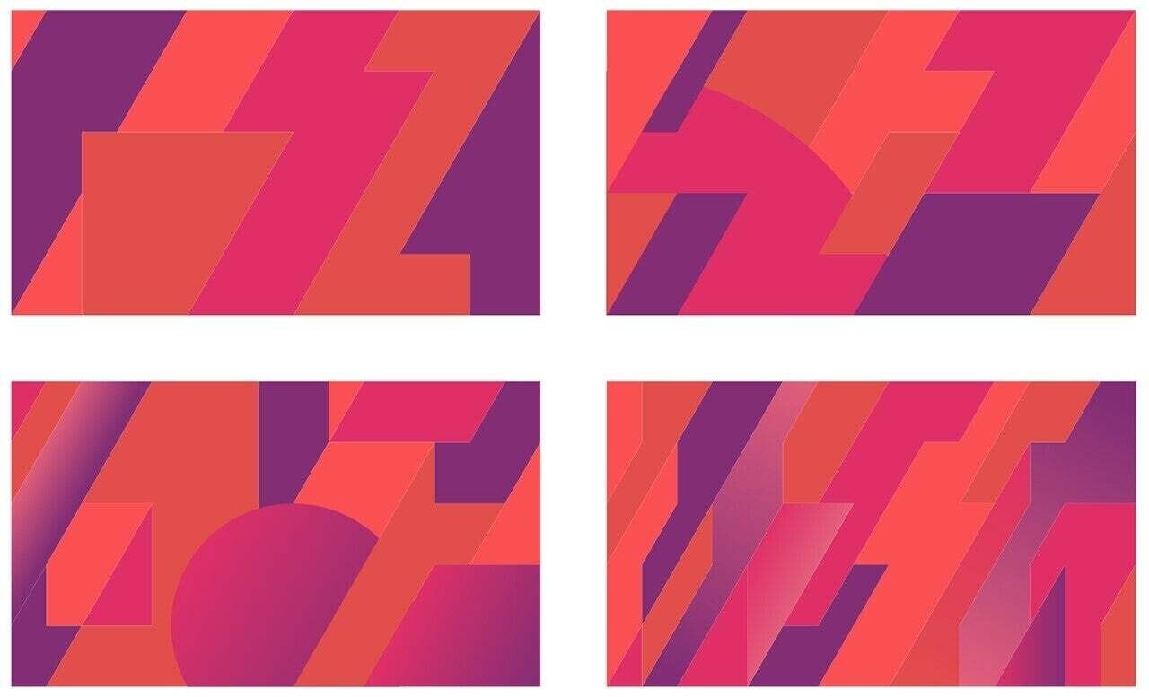
Tate:
Personally, I was impressed with the use of gradients. Since the web is generally characterized by flat designs, gradients are rare, and I felt that the unknown potential of how ZAIKO could permeate the Japanese market was also aptly expressed through this design.
Nakayama:
I thought it matched ZAIKO's image of growing in the digital world and proposed it. In the past, gradients were often avoided due to monitor specs and application capabilities, but now that various specs have improved, we are in an era where they can be properly utilized.
Also, this time, not only was it an order for the logo renewal, but we were tasked with creating a VI (Visual Identity), so to ensure we didn't complete it solely by ourselves, we created the foundational grid to work together with the creative team at ZAIKO.
Iguchi:
By coloring within this grid, we can create characters and shapes that have coherence with the ZAIKO logo.
ZAIKO Editorial Team:
The colors are also unique, providing a consistent identity.
Iguchi:
The colors chosen among various types proposed were analogous colors. I wonder if this has some significance. In a sense of diversity, you might think it would be colorful, but on the other hand, I think this color representation could characterize "fans".
If the collection of designs based on the grid and this color usage can suggest ZAIKO to the point where it becomes a recognizable identity, I think that would be what we can call identity.
IN FOCUS
A design studio focused on fields required for digital content like web, video, graphic, and photography. It crosses various fields multifacetedly, producing work focused on clients' goals.
https://www.in-focus.co.jp/
More articles

FUJI&SUN '26 artist lineup and timetable announced!
FUJI&SUN '26 artist lineup and timetable announced!
ニュース

Full lineup announced for the new urban music festival “81 MUSIC FESTIVAL”!
Full lineup announced for the new urban music festival “81 MUSIC FESTIVAL”!
ニュース

ZAIKO Waraiya! Presents: “Comedy Solo Streaming Live Award” — Held on Friday, May 1!!
ZAIKO Waraiya! Presents: “Comedy Solo Streaming Live Award” — Held on Friday, May 1!!
ニュース